East Mercer
The Details
A young family had purchased this 4 bed, 3 bath house just a few doors from their own home, with the intention to extensively upgrade the whole house and move a set of grandparents in, also creating an ADU on the lower level.
The house was a foreclosure and had been rented for many years, so there were a lot of unknowns until the existing conditions were documented.
Scope of Work
-
The creation of an ADU on the lower level by adding an interior dividing wall and door, enlarging the bedroom window for code compliance, replacing all fixtures and finishes in the bathroom and converting the existing laundry into a small kitchen.
-
Selection of new counters, tile, sink, faucet and paint colors for the kitchen area.
-
Subdividing the existing mechanical room to create a new laundry space.
-
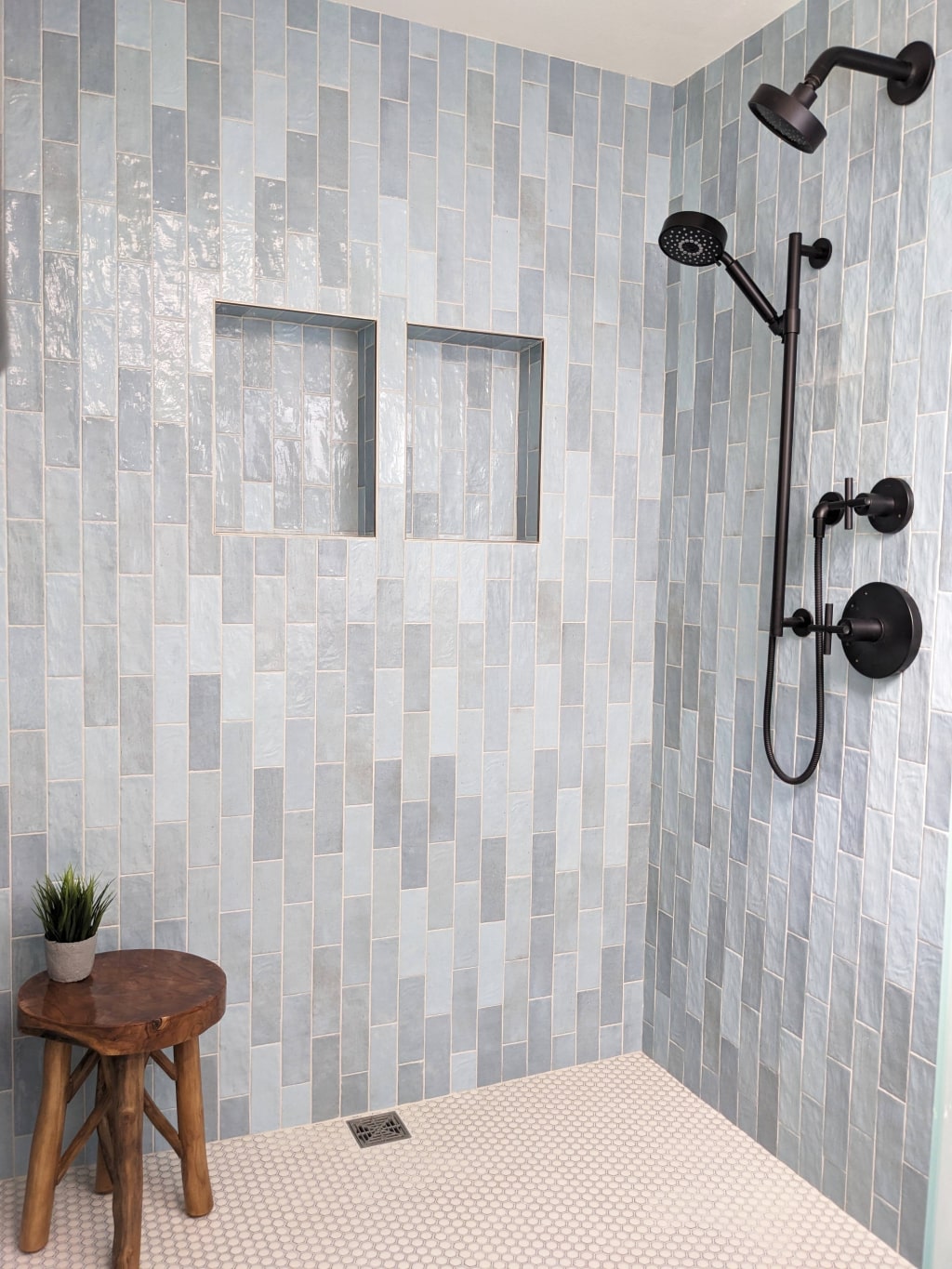
Gutting the principal bathroom down to the studs, blocking one door and altering the floor structure to allow for an enlarged transitionless shower area.
-
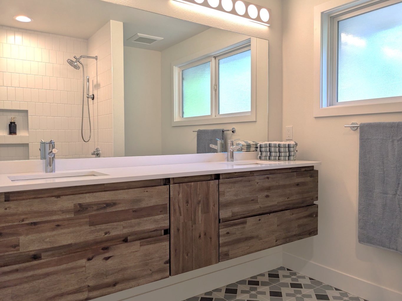
Replacing all fixtures and finishes in the hall bathroom, keeping the existing layout, and adding a second sink.
-
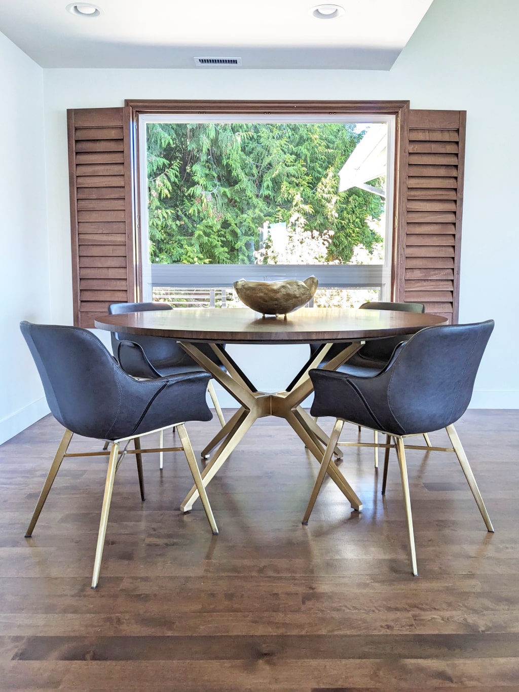
Selection and procurement of all new furniture for the kitchen, living and dining areas, using the water views from the home and the existing fireplace for color inspiration.
-
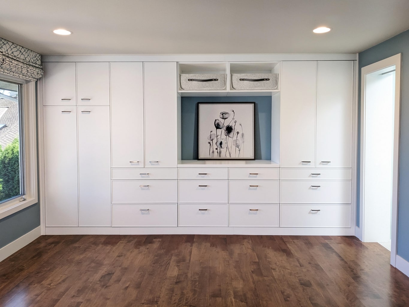
Floor refinishing and motorized shades for the main level, adding a knee wall and railing at the stairs for safety, new flooring for the ADU, new built in’s and motorized shades for the principal bedroom, new HVAC, light fixtures, door hardware and paint throughout the home.
-
Project management throughout the 6 month construction phase.
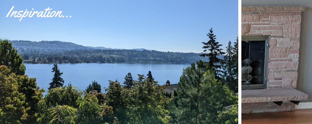
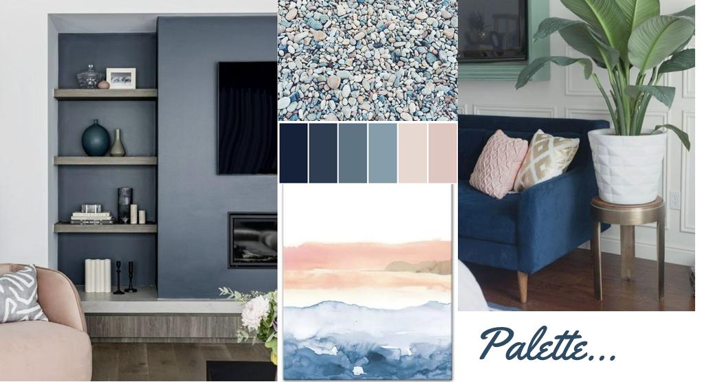
The living room area was already spacious and just needed a little updating with lighter paint colors and a darker floor color. New furniture balances the pinks of the fireplace stone and the blues reflected from the stunning lake views.
BEFORE
AFTER
BEFORE
AFTER
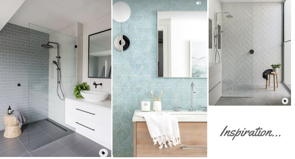
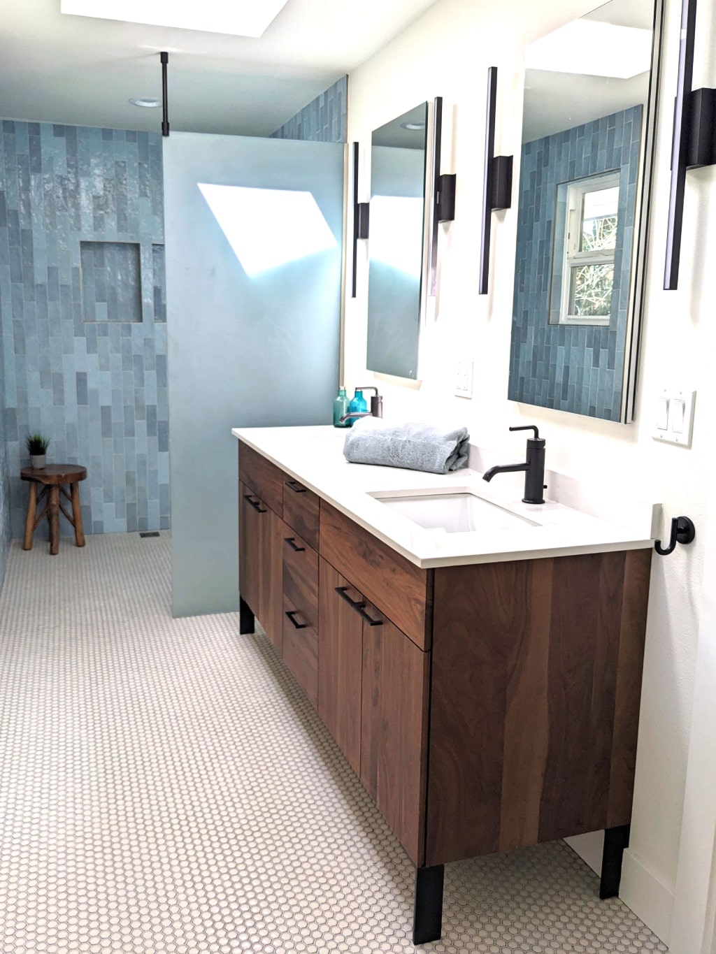
The principal bath was in terrible shape with a curling laminate floor and moldy grout. The elongated space was not helped by having two doors to the bedroom and a tiny shower squashed at one end. One door was removed and the space incorporated into an enlarged, level access shower to assist with aging in place. The shallower depth vanity and wall hung toilet help to make the space feel wider.
BEFORE
AFTER
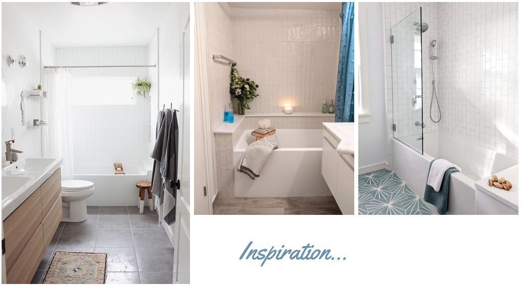
The hall bath was also very dated with an avocado colored tub behind textured glass and under a dropped ceiling, making the bathing / showering experience very cramped and dark. The tall cabinet was removed to allow for an 84” vanity with an extra sink, helping to open up the space. The fun tile lends itself to a family bathroom while giving a nod to the original mid century home.
BEFORE
AFTER
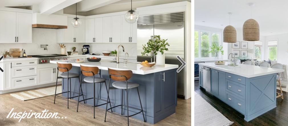
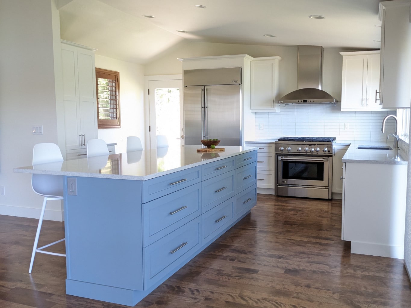
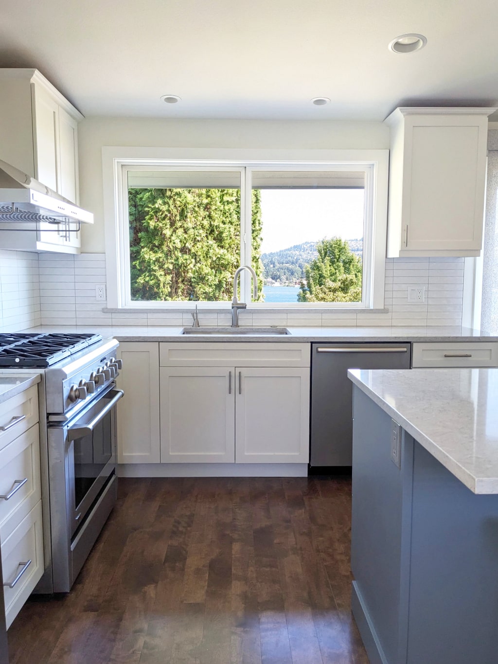
The kitchen was very dark and dated, but the cabinets were in surprisingly great shape. Layers of brown and orange were stripped away with the removal of the granite, the painting of the cabinets and the new floor color. The island had an unnecessary overhang on the living room side with a post to the floor, which was removed and still provides seating for four comfortably.
